


.png)
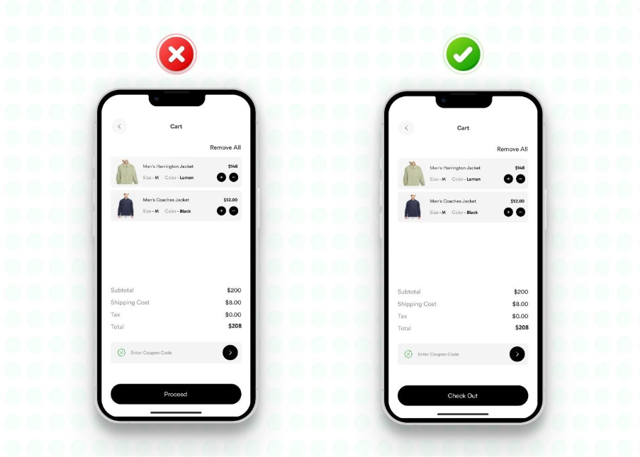
1. Onboarding Can Push Users Away
Onboarding is the first impression of your app to the users. Most users decide whether to stay (retention) or leave (bounce) within their first 60 seconds, and honestly, our old onboarding was working against us.
Many apps overwhelm users by showing everything upfront, i.e., tutorials, permissions, forms, and more. This approach often feels like homework rather than a helpful intro, which makes users leave before discovering the actual value of your product.

- Break the onboarding into small steps.
- Keep each screen light, visual, and skippable.
- Focus only on what users need to get started, not everything the app could do.
Inspired by apps like Figma and Duolingo, you can allow users to explore before asking for commitment, which will lead to higher engagement, smoother sign-ups, and more users reaching the “aha!” moment.
Remember, if your onboarding feels like a checklist, simplify it. Let users in fast and help them win early.
2. Vague Microcopy Can Confuse Users
Microcopy refers to the small clusters of words on apps and websites, such as labels, tooltips, and error messages, that guide users through pages, pop-ups, and forms. Though often overlooked, it plays a crucial role in shaping the overall user experience.
Generic buttons like “Submit” or “Continue,” along with vague error messages such as “Something went wrong,” can create confusion. Users may be unsure about the outcome of an action or how to resolve an issue, leading to frustration and drop-offs.
A more effective approach is to carefully design microcopy for every button, tooltip, and error message, ensuring clarity, guidance, and confidence at each step.
- Replace “Submit” with clear actions like “Start Free Trial” or “Save and Continue.”
- Update error messages to explain what happened and what to do next.
- Add simple and calming notes like “You can edit this later” to reduce decision stress.
The impact will be immediate, as users will hesitate less, task completion rates will increase, and support requests will decline significantly.
Remember, if your app’s microcopy sounds robotic or generic, rewrite it like you’re guiding a friend. Use everyday language. Make actions and outcomes crystal clear.
3. Lack of Motion Can Make the App Feel Static
Apps without motion or feedback often feel static. Users may tap buttons or complete actions, but without animations or confirmations, it creates uncertainty, leaving them unsure if their input was registered or if the app has frozen.
The solution lies in adding subtle yet intentional feedback:
- Added button animations to confirm taps.
- Introduced micro-interactions, like loaders, progress bars, and success ticks.
- Used motion sparingly, but purposefully, to guide, reassure, and reward.
The goal is not to be flashy, but functional. Done right, users will feel more in control, leading to higher engagement and stronger trust.
Remember, if your interface feels lifeless, add small cues. A little motion makes your product feel alive and makes users feel heard.
4. Inconsistent Patterns May Disrupt Predictable UX
Being “too creative” with interactions can become a big mistake. When swipes behave differently across screens, back buttons change function depending on context, or icons carry inconsistent meanings, the interface may look unique but ultimately feels chaotic.
It will look custom, but will feel chaotic.
These small inconsistencies force users to relearn basic actions instead of relying on muscle memory. When something as simple as navigation requires extra thought, users are more likely to leave (drop off) immediately.

The solution involves:
- Standardizing button behavior and icon functions across the app.
- Following familiar UX patterns, users already recognize from other apps.
- Auditing for interaction inconsistencies and eliminating surprises.
With consistency in place, the experience will feel smoother and more intuitive, reducing friction and encouraging users to stay engaged.
Do you want to build trust, too? Make sure to stick with patterns users already understand. Predictability reduces effort, and effort is the enemy of retention.
5. Complex UI Can Reduce User’s Understanding
More options do not always mean more value. Adding multiple CTAs, dense texts, and every feature at once often leads to “overloading.” Instead of feeling guided, users may become overwhelmed, pause in confusion, and eventually leave.

A better approach will be to:
- Simplify layouts with fewer elements per screen.
- Break long text into short and scannable chunks.
- Use white space strategically to provide breathing room.
- Prioritize one clear action per screen.
When screens are clean and focused, users will navigate with ease, attention will improve, and conversions will rise.
Remember, if users need to stop and think, your design is slowing them down. Clarity always beats complexity.
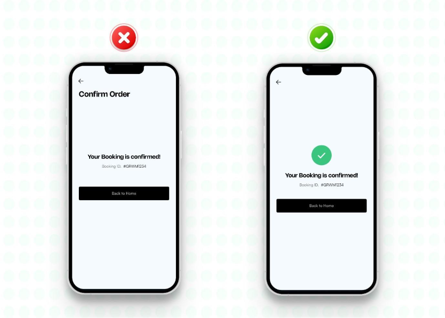
6. Missing Feedback Can Reduce User Uncertainty
Actions without confirmation create doubt. When a tap produces no message, animation, or signal, users often assume the app is unresponsive. Many will tap repeatedly or abandon the task altogether. Every action needs feedback in order to retain users.
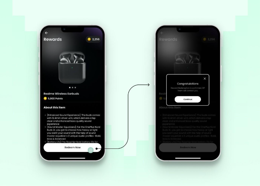
The solution will be to:
- Add success messages like “Saved!” or “Profile updated.”
- Use subtle animations to indicate loading or processing.
- Provide clear error messages with actionable steps.
- Audit every interaction to ensure no action goes unnoticed.
With consistent feedback in place, users will feel more confident, reduce second-guessing, and complete more actions smoothly.
Remember, never leave users wondering if something worked. A small message or interaction builds big trust.
7. Treating All Users the Same
A uniform experience often falls short. When every user encounters the same flow, the same tips, and the same dashboard, whether a first-time visitor or a long-term user, the design may feel consistent but not considerate of individual needs.
Beginner prompts can frustrate experienced users, while insufficient guidance can overwhelm newcomers. Without personalization, the app will fail to convey that it truly understands its users.

A more effective approach will be to:
- Allow returning users to skip onboarding.
- Customize dashboards based on roles and past behavior.
- Offer multi-language support for global audiences.
- Tailor notifications and feature suggestions according to usage patterns.
The results will be powerful, as users will feel understood. When people feel seen, engagement and loyalty will naturally follow.
Remember, don’t give everyone the same one-size-fits-all experience, because personalization is a retention strategy.
Final Talk
Many websites and apps look visually appealing, but design is not just about aesthetics, but also about enabling action. If bounce rates remain high, engagement stays low, or conversions continue to underperform, it signals the need to rethink the UX strategy.
Effective products are not only clean in appearance but also strategically designed to guide users toward meaningful actions. Whether the goal is more sign-ups, purchases, or deeper engagement, the focus should always be on creating experiences that convert.
So ask yourself, “Is your product just pretty, or is it persuasive?” If you’re unsure, we’d love to help. Let’s make it work better together. Fayafly is ready when you are!

.png)
.png)


.svg)
.png)
.png)
.png)
.png)
.png)
